Two of our reporters join a signboards tour in San Po Kong and uncover the untold tale of a historical Chinese word font.

Ever heard of the Chinese font Li Han Kong Kai ?
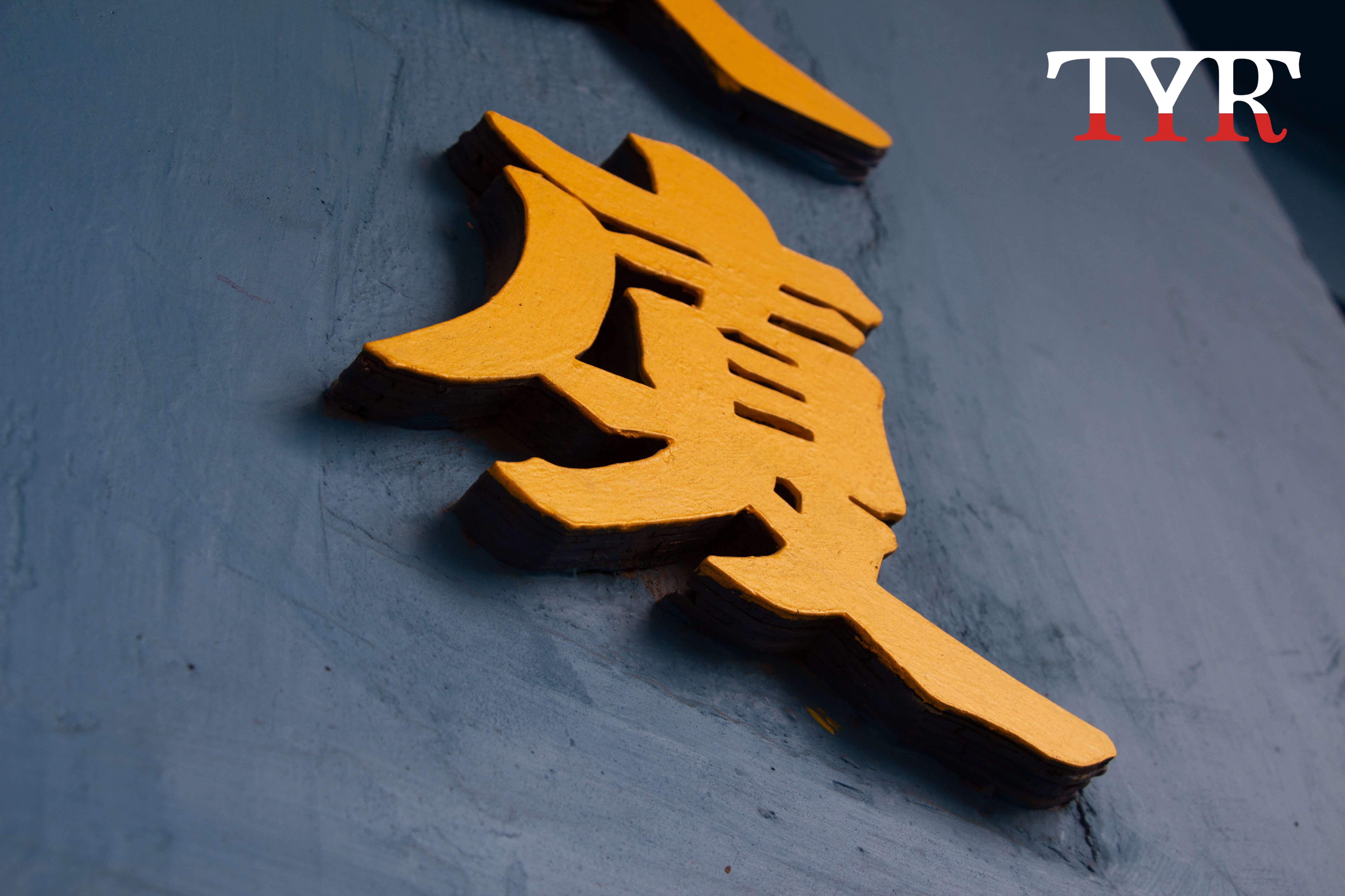
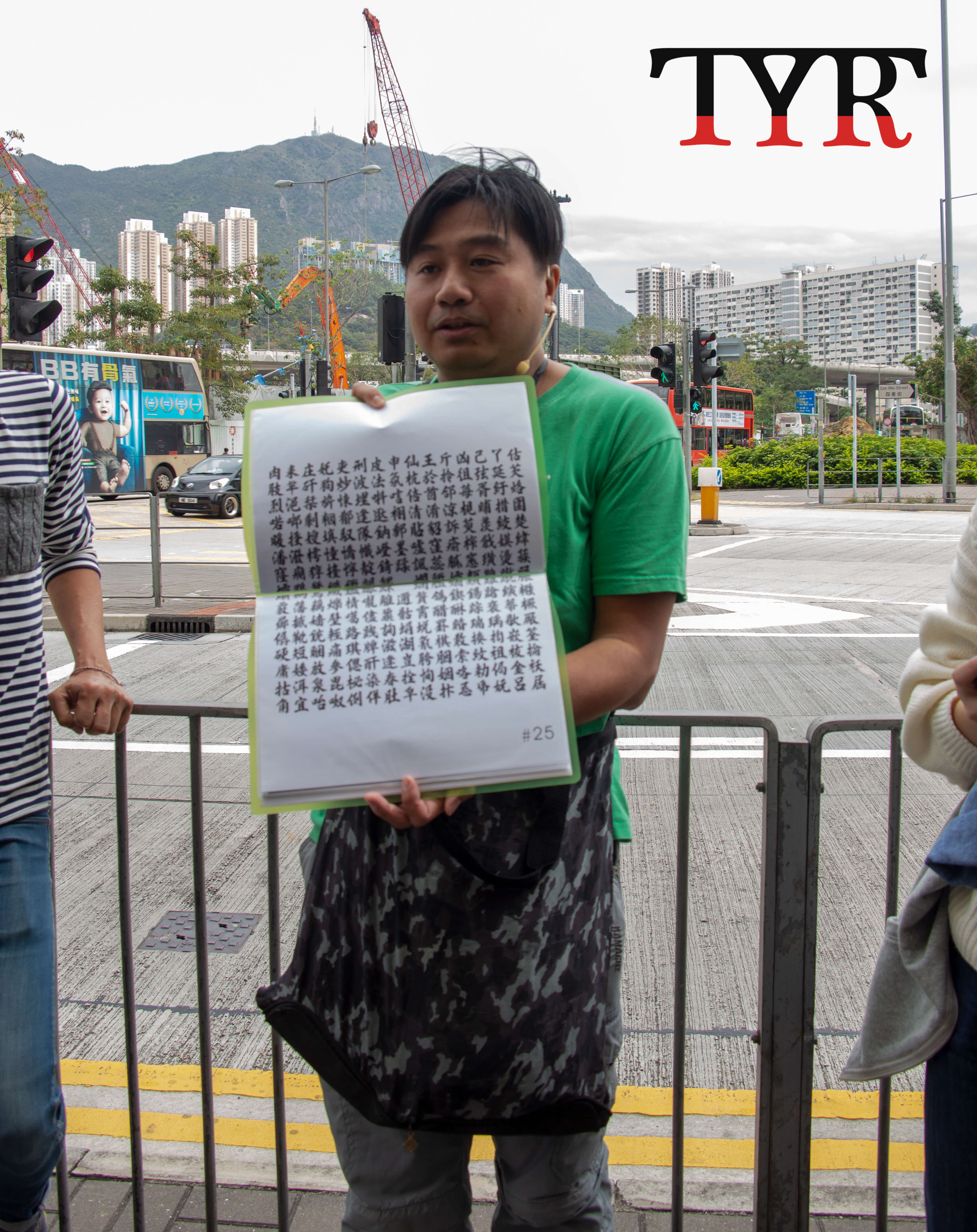
Before it stepped foot into the world of typography, it was made up of 3600 Chinese word samples from Li Han, who used to be a signboard calligrapher before he retired. Those word samples were later passed down to his grandson Lee Kin-ming, who is continuing Mr.Li Han’s work in their family-run factory.
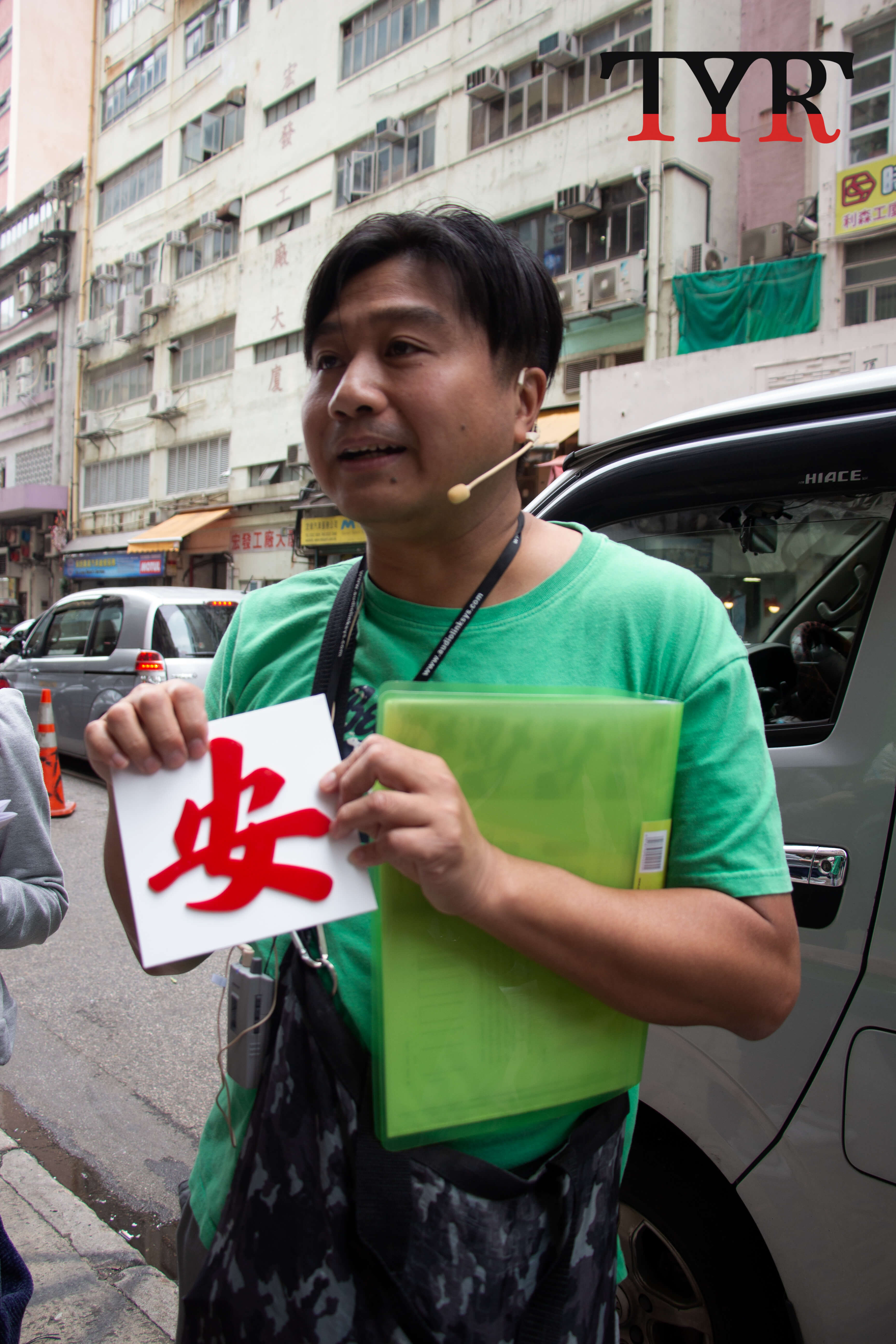
"Signboards of large companies are everywhere and everyone can notice them, but it is not the same for small shops' handmade signboards," said Mr. Lee Kin-ming, who holds regular guided tours in the weekends to introduce long-standing signboards in the city that are usually overlooked.

Compared to other old districts such as Kwun Tong, most of the shops in San Po Kong have a longer history so their signboards are still reserved, according to Mr. Lee in one of his guided tour held in the weekend before.
He said signboards in Hong Kong are usually clear and visible from a distance.
"Hong Kong shop keepers prefer grandeur fonts with thick strokes. For example, the Beiwei font looks imposing since hooks inside the characters are relatively large," he said.
Bone clinics and martial clubs usually use the Beiwei font for their signboards, while the Clerical script font is for more artistic uses, he added.
For sign boards with more complicated characters. Mr. Lee said he uses rulers and French curves to draw curved alphabets such as the English letter "U" and for numbers, he photocopies those on his calendar and follow them to draw.
For example, the Biaukai font, of which strokes in words are usually separated, has been disliked by many signboard calligraphers because it makes words hard to cut and stick on boards.

Recalling an interesting encounter with a Taiwanese participant of the tour who thought the Beiwei font made the words on the signboards appear "ferocious", Mr. Lee said the beauty and worthiness of typography change as society evolves.
《The Young Reporter》
The Young Reporter (TYR) started as a newspaper in 1969. Today, it is published across multiple media platforms and updated constantly to bring the latest news and analyses to its readers.

Weekend review: veganism struggles to grow in Hong Kong

Weekend Review: Handwritten signboards reveal Hong Kong's culture and history


Comments